
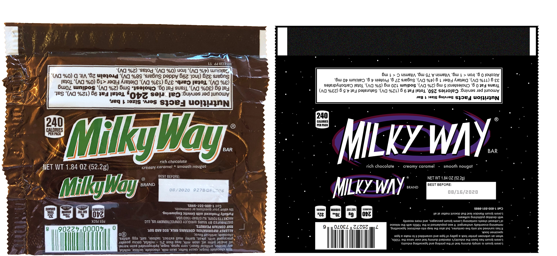
For this project I was given the task of choosing a candy bar that I thought had a poor wrapper design and redesigning it. I chose to redesign Milky Way, because I always thought the wrapper looked too similar to Snickers and the green text was ugly.
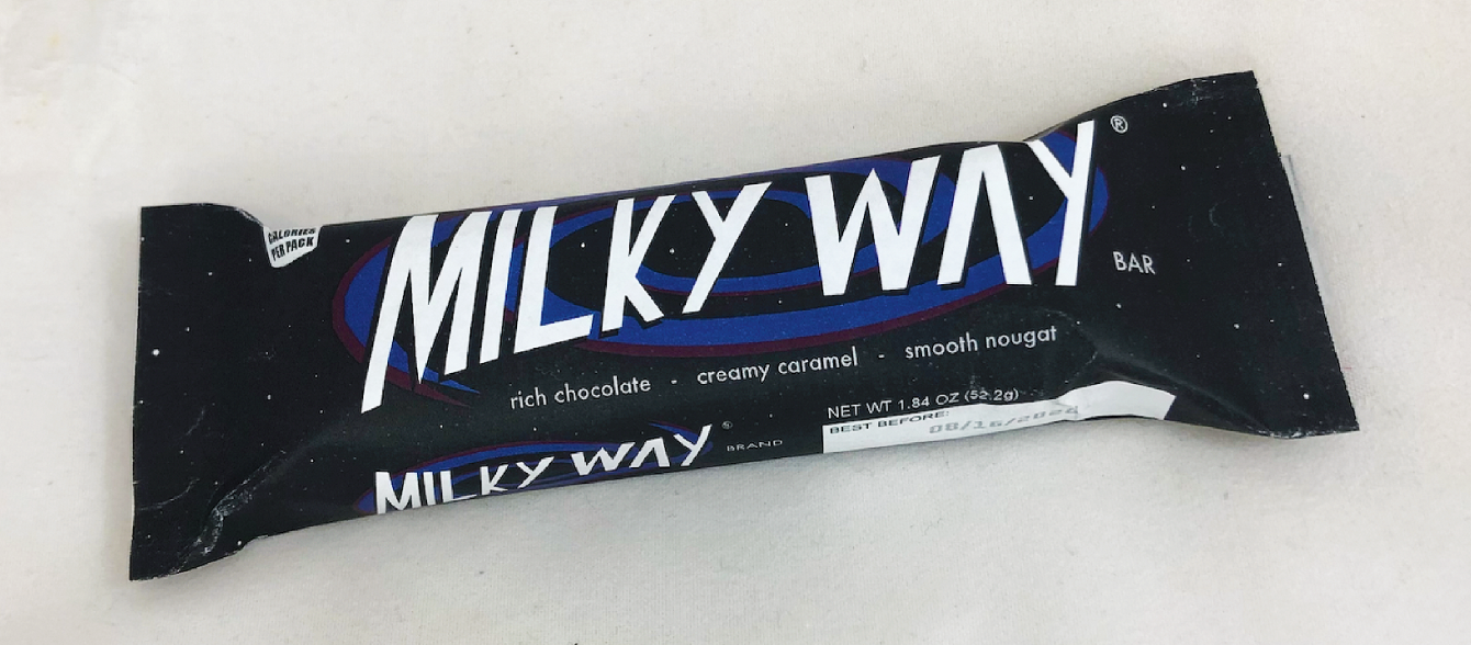
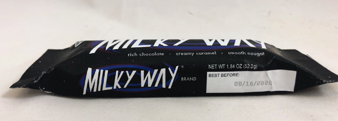
For my redesign I chose to incorporate many elements that had to do with the Milky Way galaxy. I used lots of black and purple and added stars and a large galaxy in the background. This new branding would certainly help Milky Way stand out from its competitors more and look more desirable.